
Designing an application that helps students reconnect, share hobbies, and rebuild a sense of belonging in the early post-COVID world.
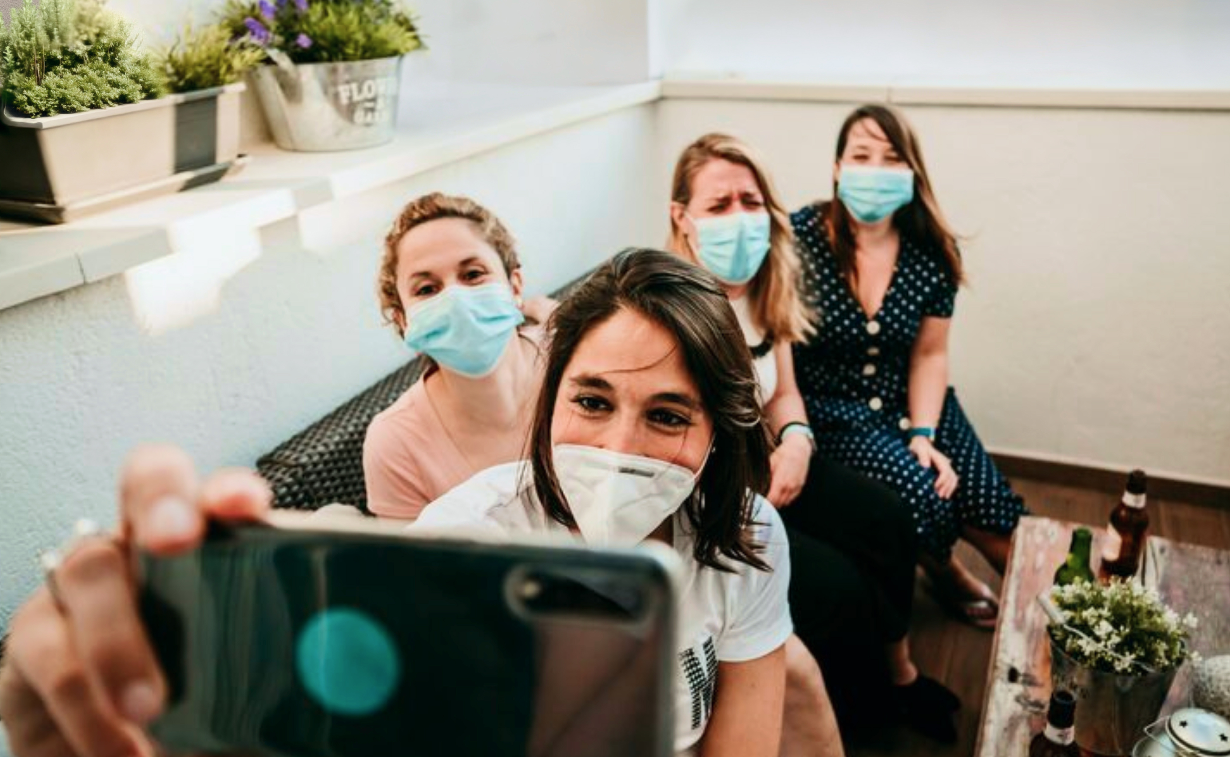
It all started during a project focused on improving digital skills among students at the height of the pandemic. But something deeper quickly became visible: many students had simply stopped showing up to class, not because of tech issues, but because they felt disconnected, unmotivated, and emotionally drained. It was about losing the small, everyday moments of student life, the casual chats, shared breaks, or spontaneous plans that once gave rhythm to the day.After the vaccine rollout, a group of Ph.D. students and professors began asking:What if we could bring back that sense of togetherness, but in low-pressure, safe ways that help students reconnect through simple, everyday activities?That question became the seed for Together.
I contributed to the full UX/UI process, conducting user research, mapping insights, sketching flows, and designing key screens in Figma while collaborating with the team to iterate and refine designs.
Based on bookings and post-activity surveys:
• 50+ student meet-ups in 3 months
• 91% found the app easy and comforting
Me as the UX/UI designer with 2 lead designers, 6 UX researchers, 1 UX writer, 1 UI designer, and 3 PWA developers.2021 - 2022
Understanding the context
To understand student struggles, we surveyed 350 students (avg. age 24, 50/50 gender split) and conducted 20 in-depth interviews, uncovering their leisure drivers, blockers, and boundary conditions. To organize our findings, we then created an affinity diagram that grouped related insights into clear themes.

Key challenges
Here are the maim pain points:
• Students get excited about quick catch-ups (like a five-minute walk) rather than big, formal events
• Seeing at least one familiar face makes it feel safe enough to jump in
• If the community it doesn’t feel emotionally comforting, students won’t join
• Simple health and safety cues (small groups, outdoor options, hygiene reminders) are a must

Clear health and safety cues (small group sizes, outdoor options, hygiene reminders) are essential to foster confidence and comfort.

Unfamiliarity with other participants, many have never met, and fear of lacking shared interests leads students to hesitate to participate.
.jpg)
Students report a shortage of engaging, accessible activities to join, which limits their chances to get involved.

Without a warm, respectful atmosphere (visual cues, tone) students won’t feel secure enough to join.
Comparative analysis
We took a look at some related social apps that do exactly what we do and others that touch on similar ideas and walked through their signup-to-event flows. We spotted smart perks that really spark people’s enthusiasm to host or join activities.


User flow
The user flow outlines the step-by-step journey a teacher takes, and we iterated over the flow a couple of times to ensure clarity and continuity at every turn.

Mood board
We picked mint green, bright orange, soft cream, and warm pink straight from our moodboard to capture those spontaneous, feel-good student hangouts, while celebrating the vibrant mix of cities and cultures they come from.


Personal profiles
Profiles featuring a bio, shared photos, key interests, and a clear activity timeline, so students can instantly feel the vibe and know if they’d be comfortable with the individuals before joining.
Profiles show each student’s past activities and shared event photos so everyone knows it’s COVID-safe and can jump in worry-free.

Shared Interest
Profiles display top interest keywords from students’ questionnaire responses, making it quick to spot peers with shared hobbies. This creates an instant sense of belonging and a comforting community vibe.

Group Visibility
By listing who’s joining and the exact group size, students get a transparent view of each meet-up before requesting to join. They can instantly see familiar names or shared interests, so there are no surprises about who they’ll be meeting.
This upfront visibility builds trust, seeing exactly who’s joining and also filtering activities by group size reduces uncertainty and COVID-safety worries, so students feel reassured and confident to jump in.

Activity categories
Activity categories grounded in Dumazedier’s theory let students switch between social, exploratory, and restorative events on demand. This filtering ensures they can easily find the activities that fit their mood.

Join requests
A request system caps group sizes and filters join-requests to prevent overcrowding, giving organizers better control and keeping meet-ups COVID-safe.
By letting hosts approve join requests, they can ensure a friendly, comfortable environment and feel confident that every participant is a good fit
High fidelity prototype


Key metrics came from bookings (confirmed meet-ups) and post-activity surveys (short questionnaires sent to users).
• 50+ student meet-ups in the first 3 months
• 90%+ found the app “easy and comforting”
This project reinforced three lessons I carry forward:
• Even small UI tweaks (copy, hierarchy, placement) have huge UX impact.
• Products require special care around trust & clarity.
Thank you for taking the time to review my work! If you’d like to see more, here are my other projects.


