

Creating an accessible and inclusive eCommerce experience that allows everyone to browse and shop seamlessly across web and app.
Greaner started with a simple but powerful goal: to make plant shopping online welcoming and accessible to everyone. From the start, we prioritized inclusion, designing for people with low vision, color blindness, limited mobility, or those using screen readers and keyboards. Every detail, from layout to interactions, was built to support different needs and abilities with clarity and ease.
I worked on UX and UI design with a focus on accessibility, contributing to research, flows, wireframes, prototyping, and testing, following WCAG guidelines.
Using data from usability tests (Maze):
• 96% Confidence rate
• 99% Direct success
• 3% Drop-off rate
Me as the UX/UI designer, alongside another UX/UI designer, two developers, and the CEO
8 weeks, 2020

Understanding the context
According to the World Disability Report (2011), over 13% of the global population lives with some form of disability. Many rely on online services for everyday needs. Our challenge was to ensure that Greaner could be easily used by people with a wide range of abilities, including those with visual, motor, and cognitive differences, aligned with WCAG 2.0 AA accessibility guidelines.
Key design condideration
I focused on the following key accessibility features:
Navigation & Interaction
• Visible keyboard focus on all interactive elements.
• Keyboard-accessible UI with proper labels and documented tab order.
• Linear, semantic content flow in code.
• Gestures always paired with alternative inputs.
Visual Design & Perception
• Text contrast ≥ 4.5:1.
• UI elements contrast ≥ 3:1.
• Color is never the only indicator.
• Consistent icon and button usage.
Scaling & Motion
• Text resizable up to 200% without breaking layout.
• Content readable at 400% zoom without horizontal scroll.
• Respects reduced motion; no essential interaction via animation.Content & Media
• Text alternatives for all media (alt, transcript, captions).
• Forms have unique, clear labels and error handling.
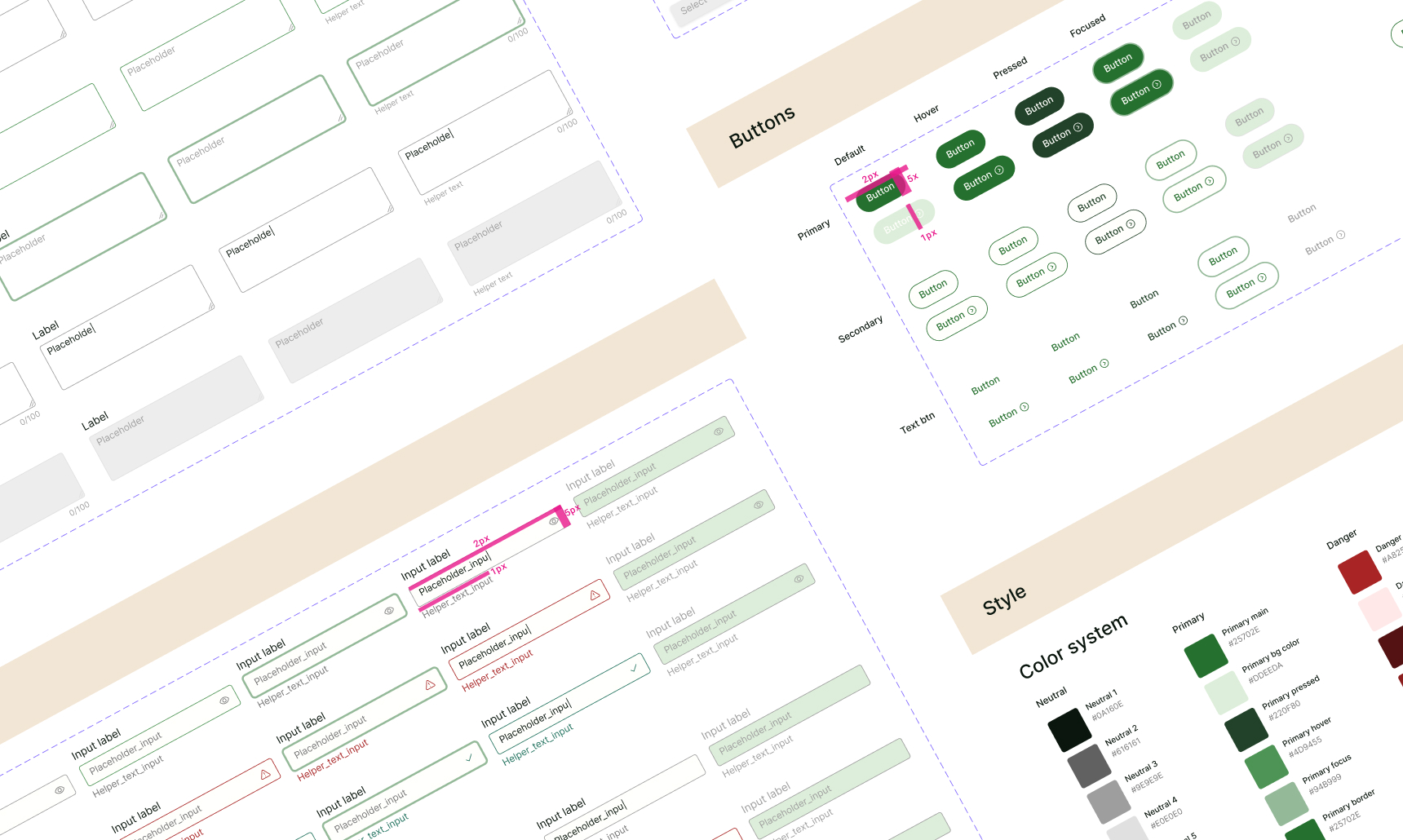
Design system
I defined a tone of freshness, calm, and trust, and built a moodboard around it, then refined it into an accessible color system using WCAG guidelines to support users with visual and motor impairments.

Animations
I used subtle animations to enhance flow, never relying on motion alone. All transitions respect prefers-reduced-motion and maintain full accessibility, while keeping the visual experience aligned with the brand.

Gestures
I ensured gestures like tap, double tap, and swipe were intuitive but never the sole method of interaction. I provided accessible alternatives for users with motor impairments, low vision, or those using assistive technologies, ensuring that all actions could be performed via keyboard, visible UI controls, or voice navigation.
Feedback
To support users who zoom or use small screens, I placed essential feedback and information directly next to buttons. This ensures clarity without extra scrolling or searching.

Developer handoff
To ensure seamless implementation, I created a detailed developer handoff document covering accessibility requirements. It included clear keyboard tab order, aria-labels, focus states, gesture alternatives, and component behaviors.
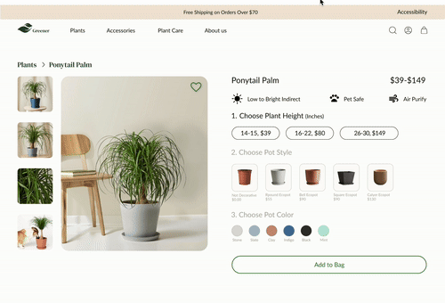
Adoptive layout


Website


Application


After incorporating feedback from the initial usability tests, I finalized and validated the Greener experience using the Maze testing platform. The results were:
• 96% Confidence rate
• 99% Direct success
• 3% Drop-off rate
%201.jpg)
This project reinforced three lessons I carry forward:
• Writing WCAG rules as testable specs worked better than sharing guidelines
• Clear accessibility specs made collaboration with developers smoother than long explanations.
• Complexity built up quietly, one modal at a time.
Thank you for taking the time to review my work! If you’d like to see more, here are my other projects.


