
Creating a seamless experience that connects digital discovery with studio life across southern Sweden.
When I joined Highersense, the brand had a loyal community but a fragmented experience.
Information about classes, passes, or even studio locations was hard to find online, and new visitors often discovered the studios only through word of mouth.
Inside the team, values were strong, but communication across digital and physical channels lacked structure and consistency.
The goal was clear: create one continuous experience, easy to find, easy to understand, and reflective of the warmth people already felt inside the studios.
As Product Manager, I led the end-to-end process, from identifying user pain points to implementing structural and visual improvements.Working closely with the founder, instructors, and booking provider, Momoyoga, I aligned design, communication, and operations into one coherent system.
Beyond digital design, I also contributed to growth by planning community events, optimizing pricing models, and shaping trial experiences that lowered the barrier for newcomers.
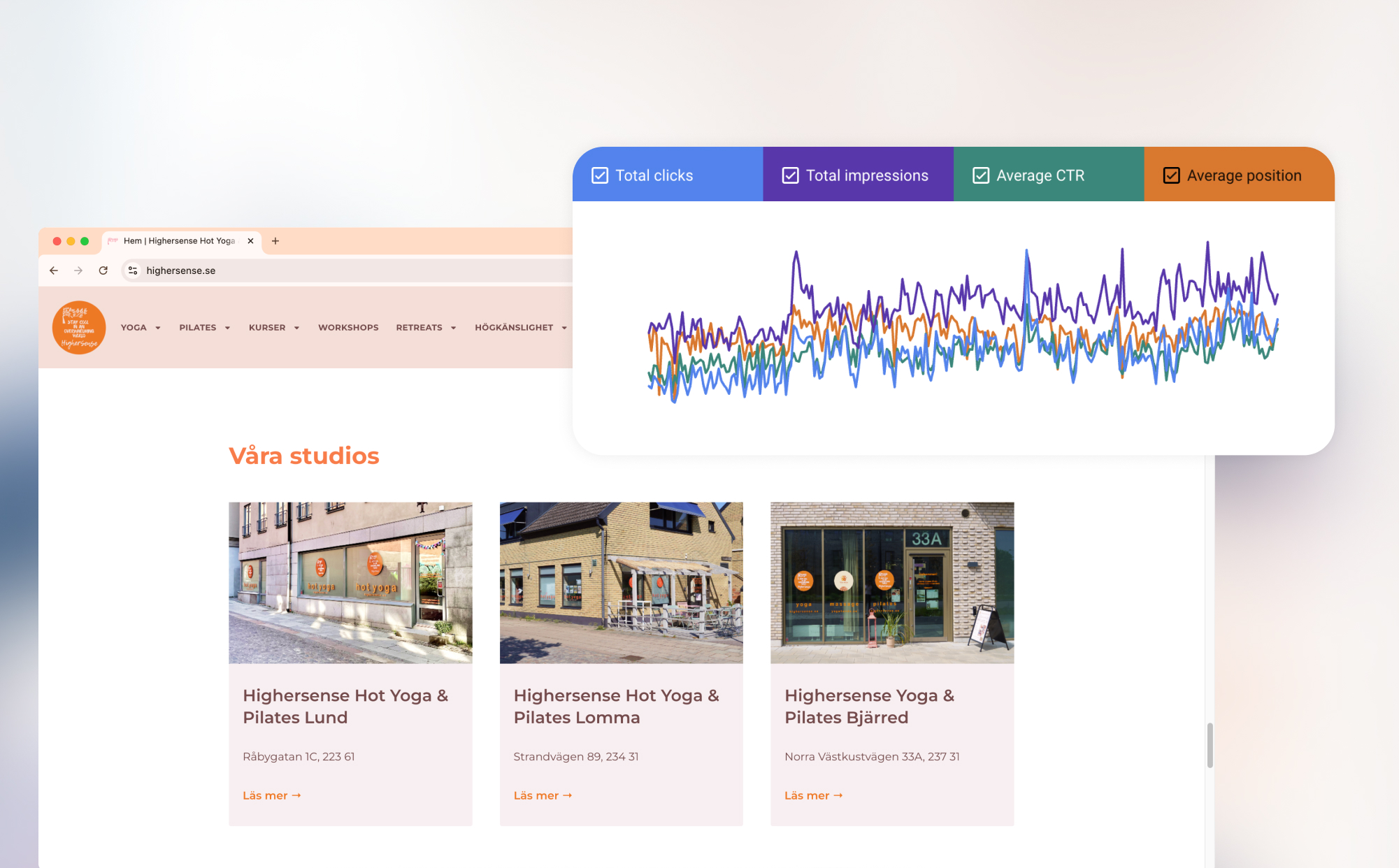
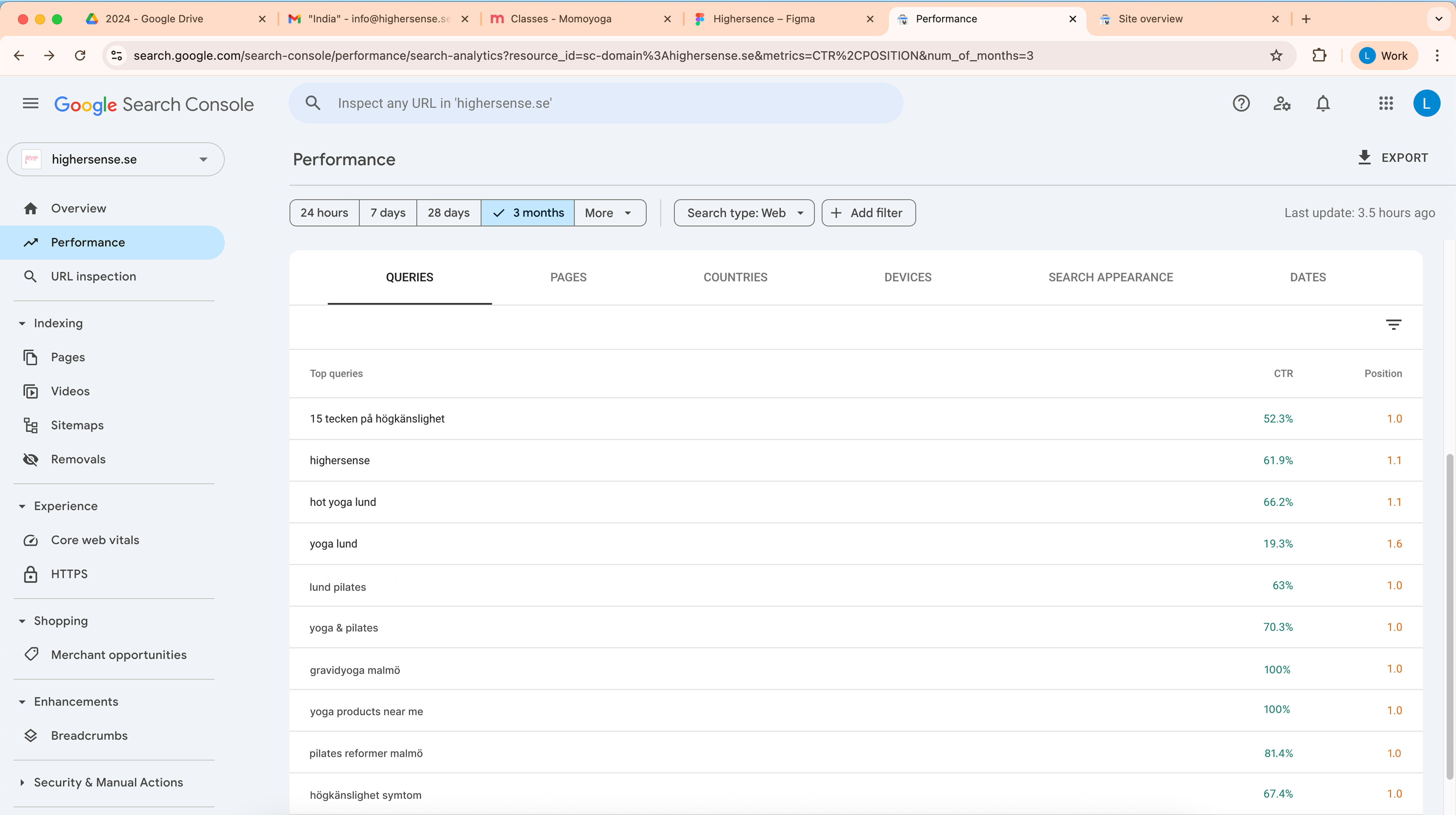
Based on data from Google Analytics, Search Console, Meta Business Suite, and booking logs:
• 400% uplift in social engagement
• 67% increase in first-time yogis
• 2× growth in Google visibility
• 53% longer average sessions
• Local ranking moved from 5th to 1st
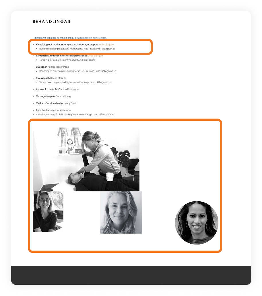
Founder & CEO, instructors, third-party booking provider, and myself as Product Manager
.jpg)
Understanding the context
With limited time and resources, formal research wasn’t possible. Instead, I collected insights through emails, observation at the reception, and free analytics tools.
Clear patterns emerged:
• No data-driven learning process in place.
• Low online visibility and poor SEO structure.
• Inconsistent brand tone and imagery.
• No gamified or engaging elements to sustain interest.
• Missing guidance for first-time visitors.
These findings shaped the roadmap for improvement.
Benchmarking the landscape
I reviewed nearby studios and wellness competitors to identify strengths and gaps.
The analysis led to a strategic focus on clarity, community, and consistency.
• Personal instructor–student relationships
• Authentic local presence across multiple cities
• Outdated website and unclear structure
• Inconsistent visuals and messages
• Introduce blog and video storytelling
• Integrate Friskvård (Epassi) for easy payments
• Launch seasonal challenges and local partnerships
• Seasonal demand shifts
• Competing studios with aggressive pricing
Quick Usability Review
Before introducing new features, I ran a quick heuristic evaluation to understand the experience from a user’s point of view.
The review highlighted both functional and emotional friction points, things that caused small breaks in flow or trust.
These findings gave us a clear list of low-effort, high-impact fixes, the foundation that later allowed the larger redesign to move faster and stay consistent.
• Brand consistency: unify logo, color, and tone across pages.
• Navigation clarity: make the active state visible and simplify menu labels.
• Form feedback: ensure users receive clear confirmation or error messages.
• Broken links: fix inactive or misdirected paths.
• Align button styles and hover interactions for smoother feedback.
• Improve text-image balance in headers for better readability.
• Add small helper cues (icons, tooltips) where users pause or hesitate.
• Broken links: fix inactive or misdirected paths.


Strategy
I built the experience strategy around three guiding principles:
1. Clarity: Make all information easy to find and understand.
2. Consistency: Align tone, visuals, and structure across channels.
3. Connection: Bring the digital and studio experience together as one journey.
This direction guided every design and content decision going forward.
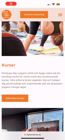
Information Architecture
Using the insights from user questions and search analytics, I restructured the website to follow a natural flow, from discovering a class to joining the first session.
This simplified journey reduced confusion and improved discoverability.
.jpg)


Design System
I created a lightweight design system, calm colors, clear typography, and photography that felt genuine and alive.
It worked seamlessly across the website, signage, printed materials, and merchandise, creating a unified experience both online and on-site.


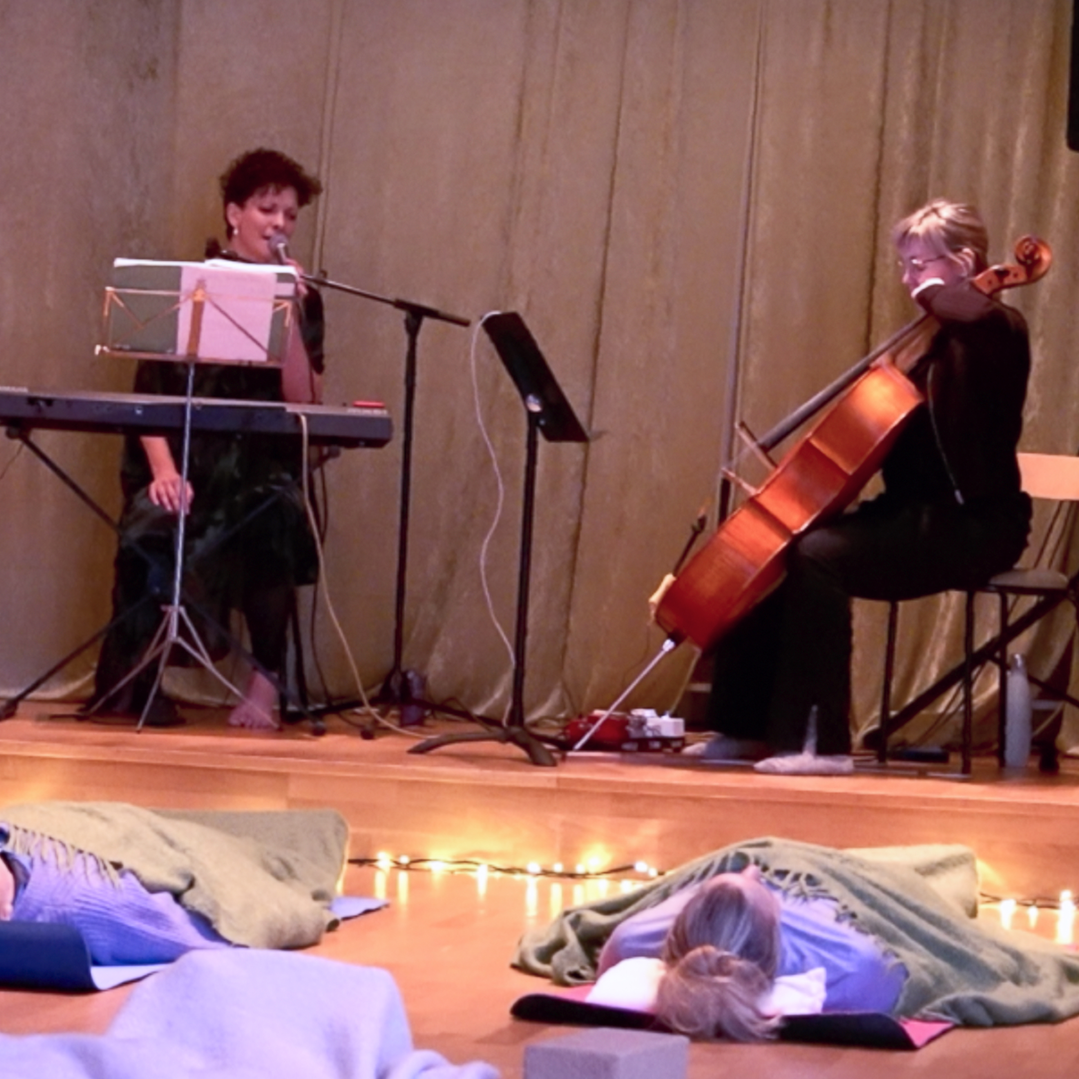
Community & Campaigns
To close the gap between digital curiosity and in-studio connection, we introduced:
• Open House days for new visitors
• Seasonal gatherings around Earth Day, Jul, and studio anniversaries
• Gamified touches, like a world map where yogis pinned their hometowns
• Prova På (trial pass) with essentials included, reducing entry barriers


.jpg)
Content Roadmap
Together with instructors, I planned a content strategy that turned the blog and social media into an ongoing learning platform, SEO-optimized articles, short videos, and authentic teacher stories.
This approach improved visibility and made the digital presence feel as warm and human as the studio itself.

The redesigned ecosystem connected curiosity with action.People could now easily discover, understand, and join, while the studio team gained a structured, consistent way to communicate their values.
• Improved discoverability and retention
• Stronger alignment across digital and physical touchpoints
• Reduced operational friction for the team
• Sustainable framework for continued growth
This project reinforced three lessons I carry forward:
• Reducing friction often creates more value than adding features.
• Everyday observations can reveal deep insights.
• Small, consistent improvements can build long-term impact.
“I’m really impressed by how you’ve brought everything we do into one beautiful whole. we are running from one thing to the next all day, juggling different tasks, but seeing it all laid out so clearly gives me goosebumps and reminds me just how much we accomplish.”
– Linda, CEO & Founder
“From the moment I checked out the website, it felt like a beautiful home full of friendly people. That comfort is exactly what made me feel confident enough to apply to teach here.”
— Zsu, new Pilates instructor
Thank you for taking the time to review my work! If you’d like to see more, here are my other projects.


